Google has interesting responses to certain searches. Try out the following:
Did you mean:
Animations
Cherry blossom click on the flower.

DVD screensaver switch to another application then back to see it.
Phoebe Buffay click on the guitar.

Robservations of my world and how it works
Google has interesting responses to certain searches. Try out the following:
Cherry blossom click on the flower.
DVD screensaver switch to another application then back to see it.
Phoebe Buffay click on the guitar.
Here is a list of great user experiences
Thanks to @SetupSpawn on YouTube for these great ideas.


3. Referencing the punishment for breaking the law seeks to inform riders that if you don't wear your seatbelt you can get a ticket of at least $142. This probably speaks to riders who are cost conscious.

Tomorrow, April 24, 1564, we commemorate William Shakespeare's 460th birthday.
Shakespeare quote of the day...
 |
| "An SSL error has occurred and a secure connection to the server cannot be made." |
This was from the extended cut of Shakespeare's director commentary.
He was really ahead of his time. Above is the modern English version. Here is what he actually said...
An ssl 'rr'r hast did occur and a secureth connection to the s'rv'r cannot beest madeth. fie! cometh h're and englut mine own coxcomb thee distemperate blinking idiot
Translate modern English to Shakespearean on LingoJam
In honor of the anniversary of Sharpie, August 1964, here are some photos that you can use.


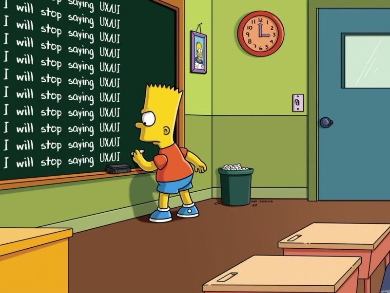
Bart Simpson is well known for getting into trouble at school. A common punishment is to write a lesson several hundred times on the chalkboard. Today his lesson is...
I will stop saying UX/UI

Let's hope everyone behaves and doesn't drop any tables...
If we are aware of our emotions and feelings that is great.
Most of the time we might only be aware of the core feeling.
To really get an understanding of what you are feeling, you can view the next 2 rings.

For example,
Anger > Frustrated > Infuriated / Irratated
Happy > Joyful > Liberated / Ecstatic
By identifying the deeper level emotion you can be more self-aware. You can also use this tool in the other direction. If you are aware of a deeper emotion you can express to your relationships how you are feeling. This will help them to connect and understand your state of mind. Not by knowledge alone, rather because they are more likely to have had that core feeling and then can relate to your situation.

I really appreciate the commitment to this costume.
Lloyd and Harry in their pet grooming business - the shaggin' wagon!

Someone ordered pizza online. There was a slight misunderstanding.
This 'experiment' eventually became a meme.
Read more about the None Pizza with Left Beef trend on Wikipedia


These beauty brands and products, harness, universal design principles to accommodate low vision, motor, impairments, and other needs.
Computers are getting smarter. There is a website that can generate artwork based on typed input.
This is artwork based on the phrase "Portrait of Brutus the Buckeye as a human"


So, what's your idea of a perfect date?
YYYY-MM-DD. I find other formats a bit confusing.

To gain a better sense of what it is like to have color blindness, here is a online text.
https://www.color-blind-test.com/images/huetest/Farnsworth100.html


Cat parents, is this true?
Difference between User Interface and User Experience
This illustration compares the interface of a classic ketchup bottle and the experience of a modern ketchup bottle.

https://www.patrickhansen.com/
Here are side-by-side photos of the movie, Guardians of the Galaxy. The character Rocket is a Racoon. The actor playing Rocket is wearing a suit. The work that goes into making the front-end is often messy and looks nothing like the final product.

This is a reminder that even Michael Jordan - the greatest basketball player of all time - still had a coach.
Who is your coach?


